

Role: Creative Lead, Brand Strategist
Tools Used: Adobe Creative Suite (InDesign, Illustrator, Photoshop), Internal Brand Guidelines, MS Office
Team: Internal marketing & communications, Executive stakeholders, Michelin brand oversight
Objective:
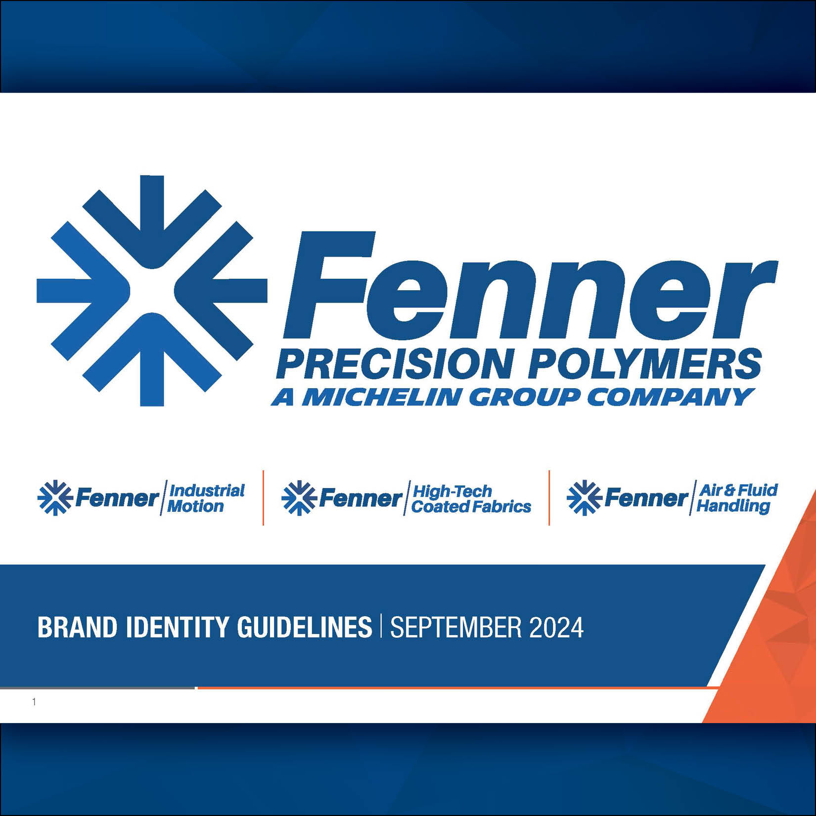
Fenner Precision Polymers had grown through acquisitions, resulting in a house of brands with inconsistent visual identities, messaging, and market presence. The goal of the brand redesign was to unify Fenner and its sub-brands under a cohesive visual and strategic identity that aligned with Michelin’s standards—without erasing the unique legacy of each company.
Process:
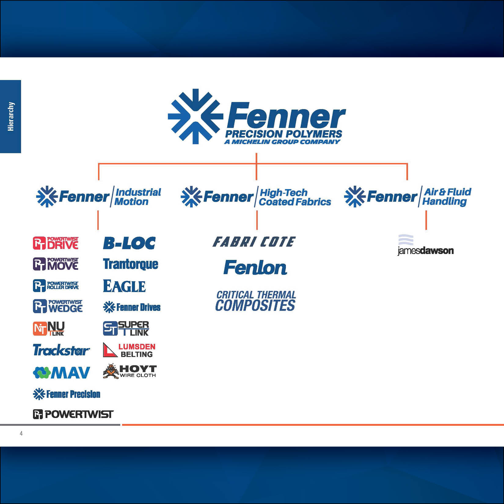
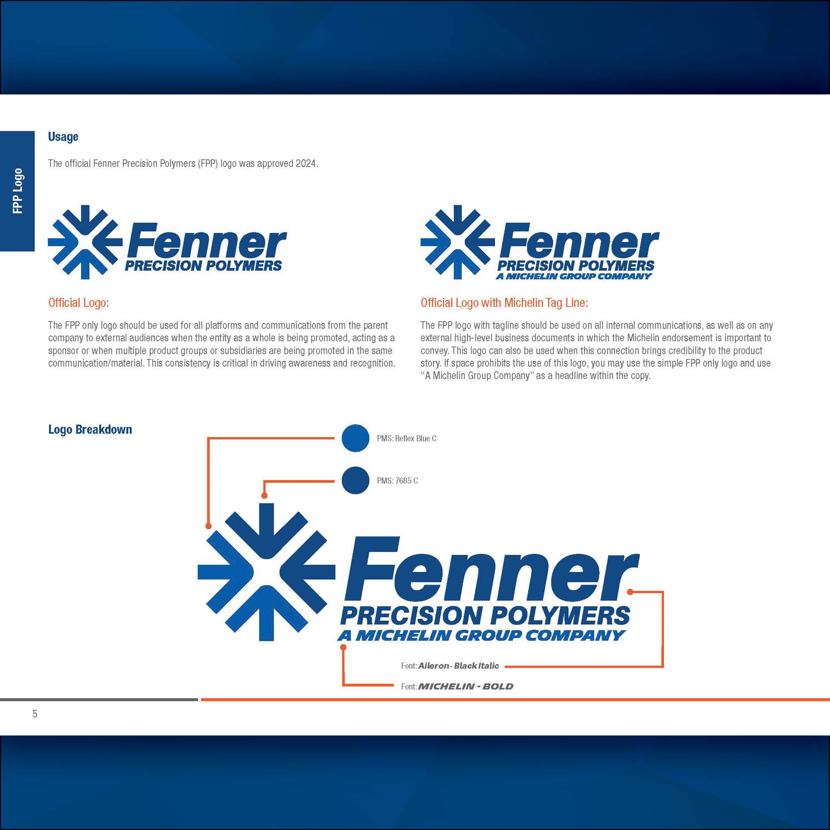
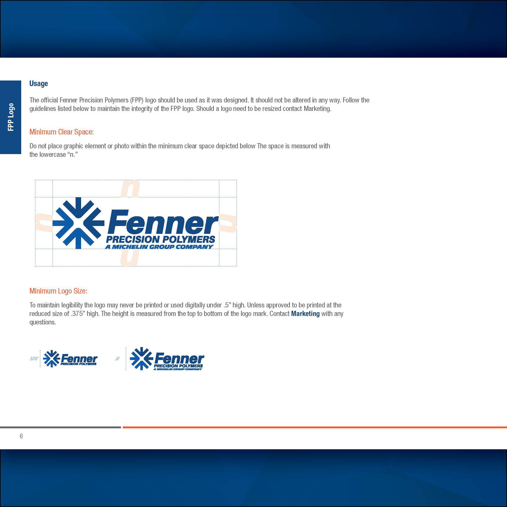
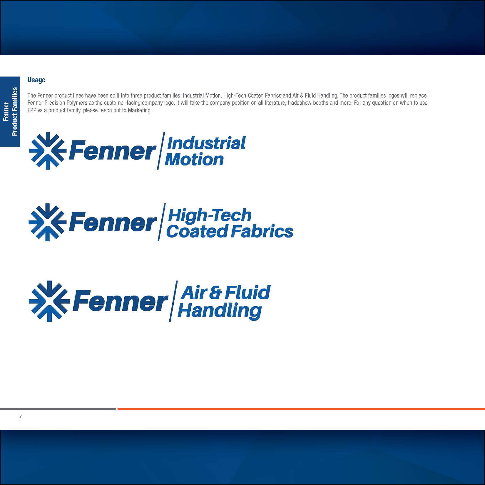
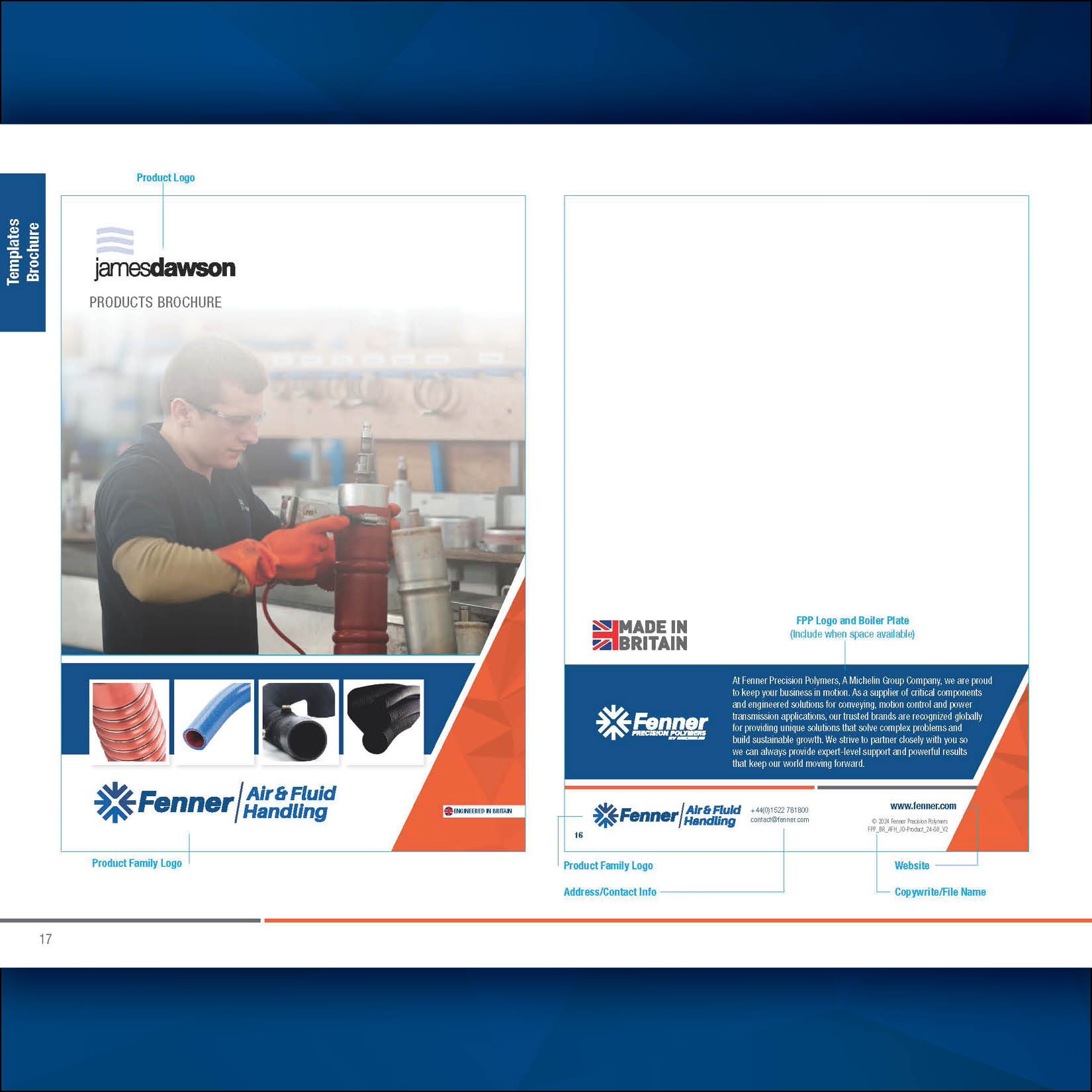
The process began with figuring out the company vision on what our hierarchy of brands was. To this point we were operating as a house of brands but with the new branding initiatives shifted towards a branded house. To do this we looked at the big three, or what would end up being the Fenner groups. The groups were the three divisions of the company: Fenner Industrial Motion, Fenner Air & Fuild Handling, and Fenner High-Tech Coated Fabrics. After establishing the groups we then moved all former companies/products under one of these groups. Once marketing established the hierarchy of brands we looked at existing brand assets across all acquired companies, identifying inconsistencies in tone, design, logos, and messaging. I worked closely with leadership to define the core values and voice of Fenner moving forward. From there, I developed a comprehensive brand system, including:
-
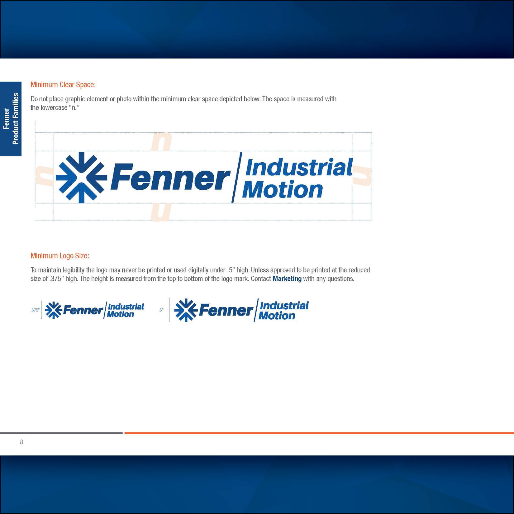
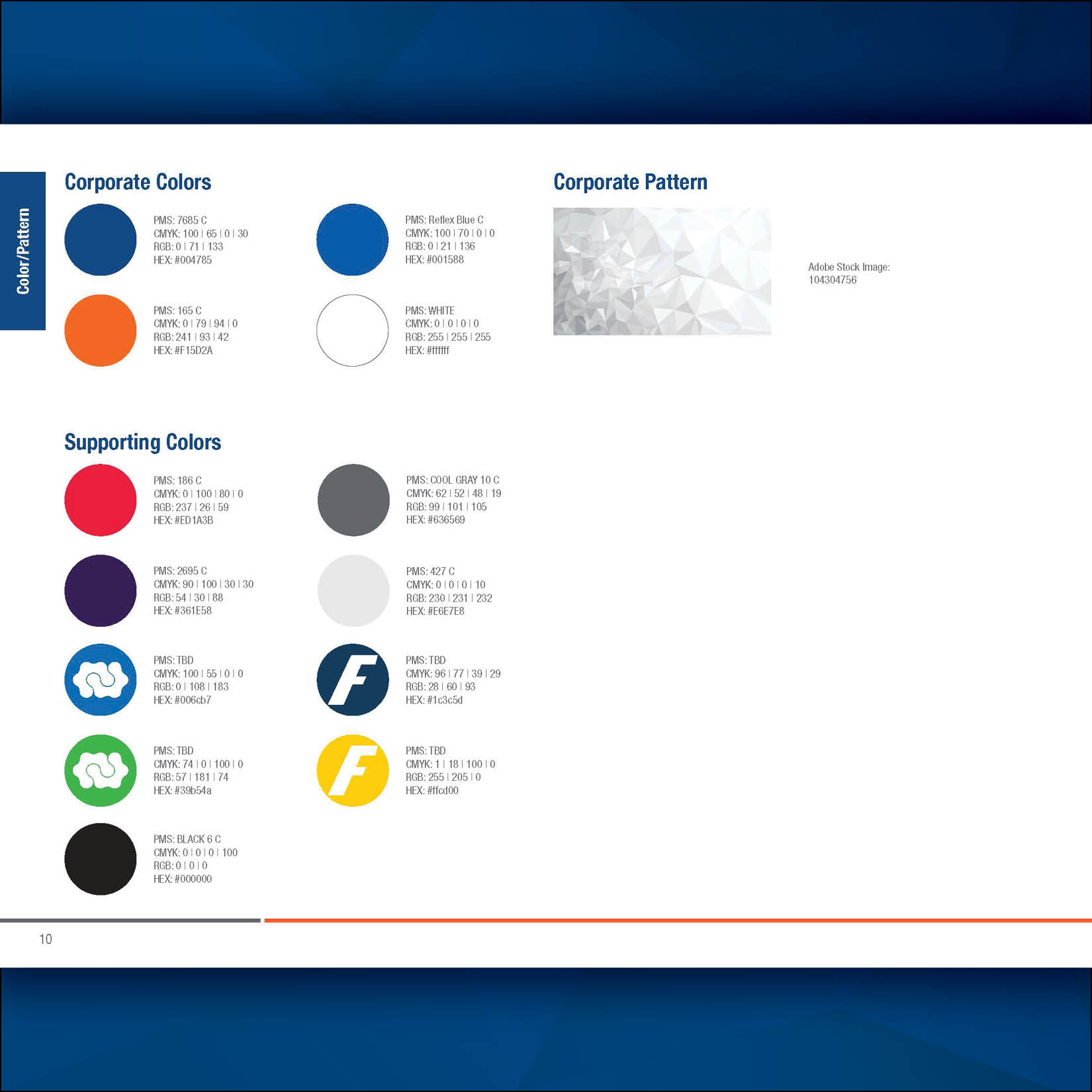
Logo and color usage guidelines
-
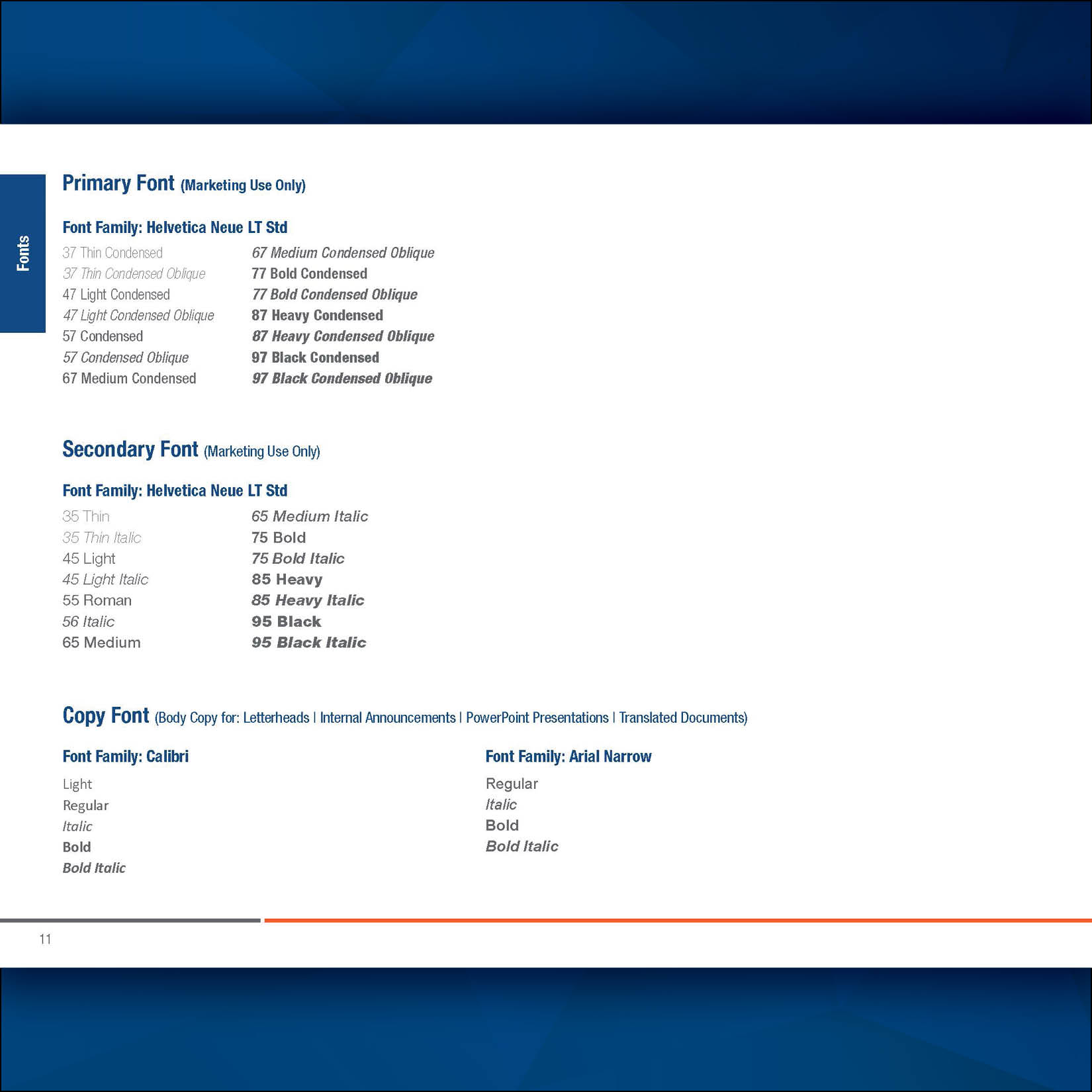
Typography standards
-
Image and iconography styles
-
Messaging hierarchy (corporate > group > brand)
-
Templates for collateral, presentations, and literature
-
Visual frameworks to clarify how brands relate within the Fenner ecosystem
Throughout the process, I collaborated with teams across the globe to ensure adoption while honoring local brand equity. I also developed internal documentation and presentations to educate stakeholders on the new system.
Outcome:
The brand redesign created a modern, unified identity for Fenner that streamlined communications, simplified customer experience, and strengthened the company’s positioning as an innovation-driven leader. It also made it possible to create consistent marketing materials, such as the 400+ redesigned literature pieces and the new website launch.
Reflection:
This project was about more than fonts and logos—it was about aligning identity with strategy. One of the most valuable takeaways was learning how to balance creative direction with internal advocacy: guiding change while respecting legacy. It laid the foundation for future initiatives, like video storytelling and digital marketing, that now feel cohesive and connected.